
- Call us1-360-329-5413
- Request a quote


The Role of Typography in Commercial Vehicle Wrap Design
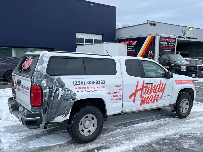
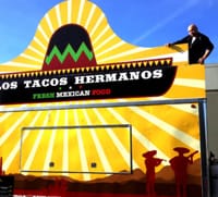
At Wrap Guys America, we’ve seen plenty of wraps that look stunning in a parking lot and disappear the moment they hit traffic. Typography is one of the most underestimated factors in whether a vehicle wrap actually generates leads or just generates compliments from your employees. If the people behind you at a red light can’t read your phone number, that’s a missed opportunity you’re paying for every single day.
Your Font Is Doing Half the Selling
Before anyone reads a single word on your truck, your typography is already communicating something. A heavy, blocky sans-serif reads as reliable and established. A clean modern typeface feels approachable and current. Script and decorative fonts signal creativity, but they can also be hard to read at 45 miles per hour.
The practical takeaway for business owners:
- Professional services (contractors, HVAC, plumbing) perform best with traditional or semi-bold sans-serif fonts that project confidence
- Creative or lifestyle brands can lean into modern, lighter typefaces without sacrificing legibility
- Decorative and script fonts belong in accent roles only. Taglines, not phone numbers.
Your font choice isn’t an artistic decision; it’s a sales decision.
Find out how vehicle wraps perform in extreme heat.
The 3-Second Test Every Wrap Has to Pass
Moving vehicles give viewers a narrow window to capture your message, and that window is shorter than most business owners expect. A well-designed wrap answers three questions almost instantly:
- Who are you? (company name, largest element)
- What do you do? (service line or tagline, secondary size)
- How do I reach you? (phone number or website, clearly placed)
This is visual hierarchy in action. The mistake we see most often is treating all three tiers with equal visual weight: same font size, same colour, same emphasis. When everything is equally important, nothing is. Your company name should be noticeably larger than your tagline, and your contact information needs to be distinct and scannable, not buried in the design.
Stick to two or three typefaces maximum. More than that and the wrap starts working against itself.
Legibility Is a Technical Problem, Not Just an Aesthetic One
A lot of DIY designs fall short here. Legibility on a vehicle wrap isn’t just about picking a good font. It’s about how that font performs under real-world conditions.
Font Weight
Ultra-light or thin font weights look sleek on a screen and disappear at distance. Extremely heavy weights can blur together when viewed from across an intersection. A medium to semi-bold weight typically gives you the best performance across viewing distances.
Case Usage
Long blocks of all-caps text are harder to read quickly than standard mixed case. All-caps works well for short company names or single words. For anything beyond three or four words, mixed case keeps the eye moving faster.
Contrast
High contrast between text and background is non-negotiable. Dark text on a light surface, or light text on a dark surface: that’s the foundation. Where it gets tricky is in the details. Busy or photographic backgrounds reduce legibility fast. Colour choices that look great in a design file can wash out on a printed vinyl surface. Outline or stroke effects on text are a common workaround, but a solid colour block behind the text almost always performs better.
Vehicles Aren’t Flat Billboards
This is the reality that separates professional vehicle wrap design from guesswork. Your truck has door handles, panel seams, wheel wells, and curves. Text that runs across a door crease gets distorted. Typography placed over a door handle becomes unreadable the moment the door opens. A design that looks clean on a flat proof can look fractured on an actual vehicle.
Good typography placement accounts for a few key factors. Panel breaks matter because text should start and end cleanly within a panel when possible. Door handles and hardware are another consideration: critical contact information needs to live in a clear zone away from interruptions. Surface curves also play a role, since fonts with consistent stroke widths hold up better when wrapped around contoured surfaces.
Learn about some of the most common car wrap design mistakes to avoid.
The Mistakes That Cost You the Most
If you’re evaluating a wrap design or gearing up for your first one, watch for these common typography problems:
- Too much text: Every line you add reduces attention to every other line.
- Low-contrast colour combinations: Test your design in black and white to see if the hierarchy still holds.
- Inconsistent font use: Mixing too many styles creates visual noise that makes the whole wrap harder to process.
- Contact info buried in small print: Your phone number should never require effort to find.
Let’s Make Sure Your Typography Works as Hard as Your Truck Does
Good typography on a vehicle wrap isn’t about making something pretty; it’s about making sure every impression you generate in traffic actually converts. At Wrap Guys America, we work through the design details that turn a wrap into a 24/7 lead generator, not just a moving decoration. If you’re planning a new wrap or rethinking an existing one, give us a call at 1-360-329-5413. We’ll make sure every word on your truck is earning its place.


Request a Quote:
We love meeting new friends.